
Why Landing Pages Matter
Your landing page is your digital handshake. Research shows that 55% of visitors spend fewer than 15 seconds on a website before deciding to stay or leave. In that fleeting moment, your design must communicate trust, value, and direction — all without a single word being read.
According to a study by Stanford University, 75% of users judge a company's credibility based on web design alone. The science is clear: design isn't decoration — it's communication. And the principles that govern effective landing pages are rooted in psychology, not aesthetics.
The 7 Scientific Principles
These principles are drawn from expert analysis of hundreds of high-converting websites, including work for Fortune 500 companies. Each principle is backed by research in cognitive psychology, eye-tracking studies, and conversion rate optimization data.
The Hero Section — Your 5-Second Pitch
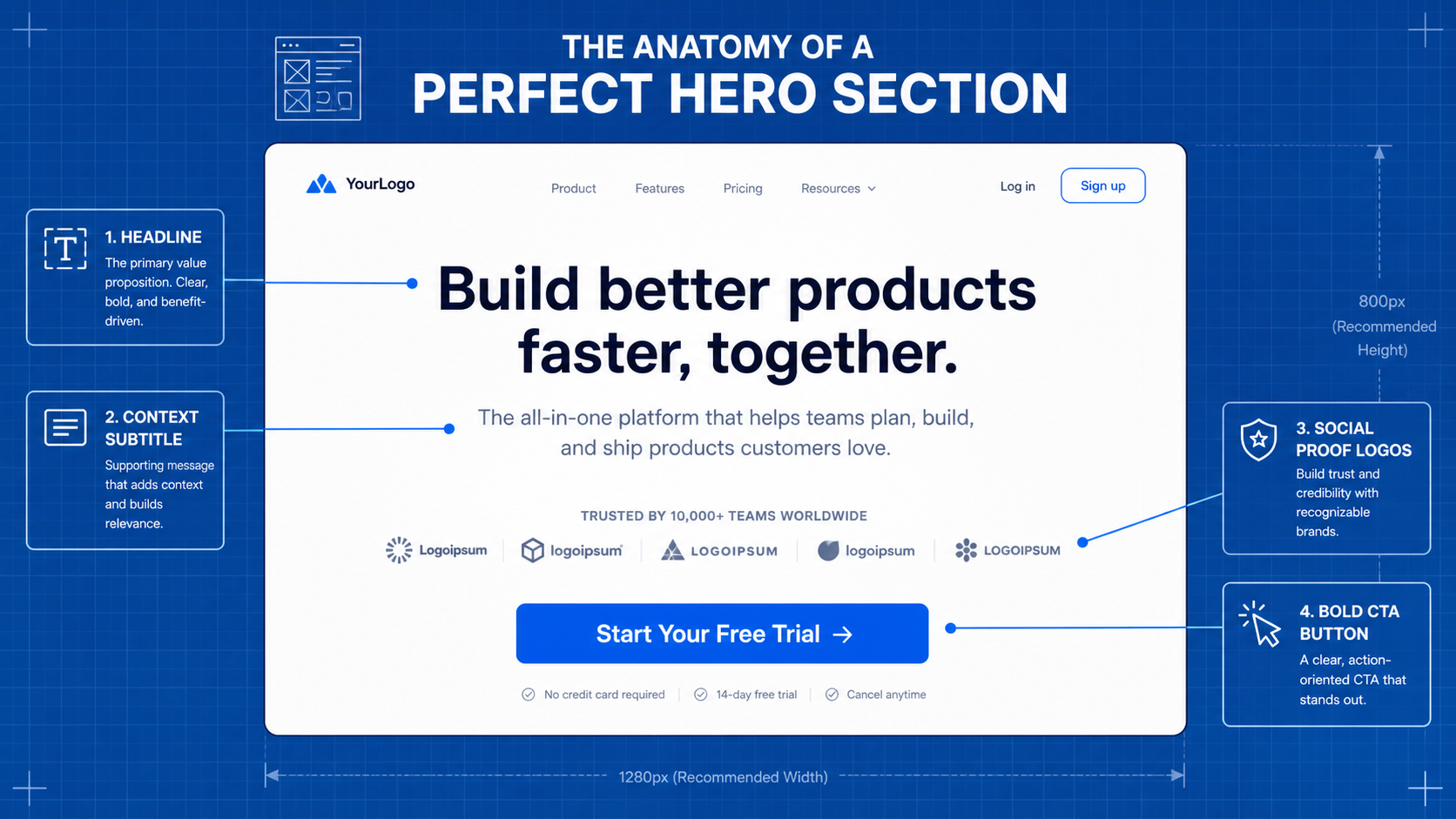
The hero is the first thing visitors see before scrolling. Research from the Nielsen Norman Group shows that users read in an F-pattern, with the most attention concentrated at the top. Your hero must do most of the work on its own.
A high-converting hero needs four elements visible without scrolling:
- Clear headline — Says what this is in one line
- Context — Says who it's for or what it does
- Social proof — Shows others trust this
- Call to action — The obvious next step
"Even if the visitor never scrolled past the hero, never saw a testimonial or stat below the fold, they could still make a decision from that one screen alone." — Expert Web Designer (17+ years, Fortune 500 clients)
Visual Hierarchy — Guiding the Eye
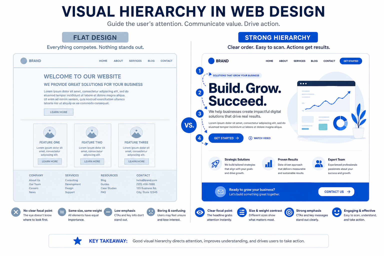
Visual hierarchy is deciding what the eye sees first, then second, then third — purposefully. When everything is the same size and weight, the eye has nowhere to land. The result reads as noise, even if every individual piece is well-designed.
The fix: make the single most important thing the biggest and boldest, then incrementally turn down everything else.
- Main headline — Loud, dominant
- Supporting text — Quieter, smaller
- Fine print — Quietest, smallest
"The quickest way to test your page: squint your eyes at it. If you can still tell what the most important thing is, your hierarchy works. If it all blurs into one gray block, nothing's leading the eye."
White Space — The Expensive Look
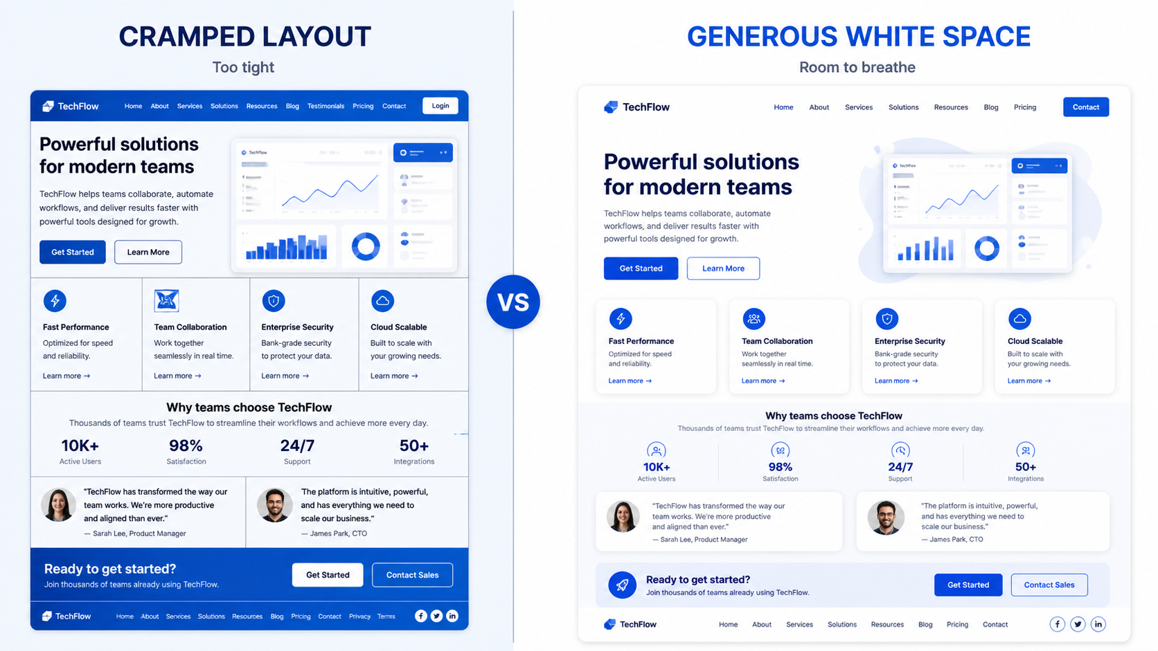
White space is the empty space around elements. Beginners instinctively fill it because empty space looks unfinished. But research shows the opposite: space is what makes a site feel expensive.
A study by Wichita State University found that white space around text improves comprehension by 20%. When you give an element room, you're telling the visitor this thing matters.
"When a section feels off but you can't say why, the answer is almost always that it needs more space — not more stuff."
Contrast & Color — The Click Driver
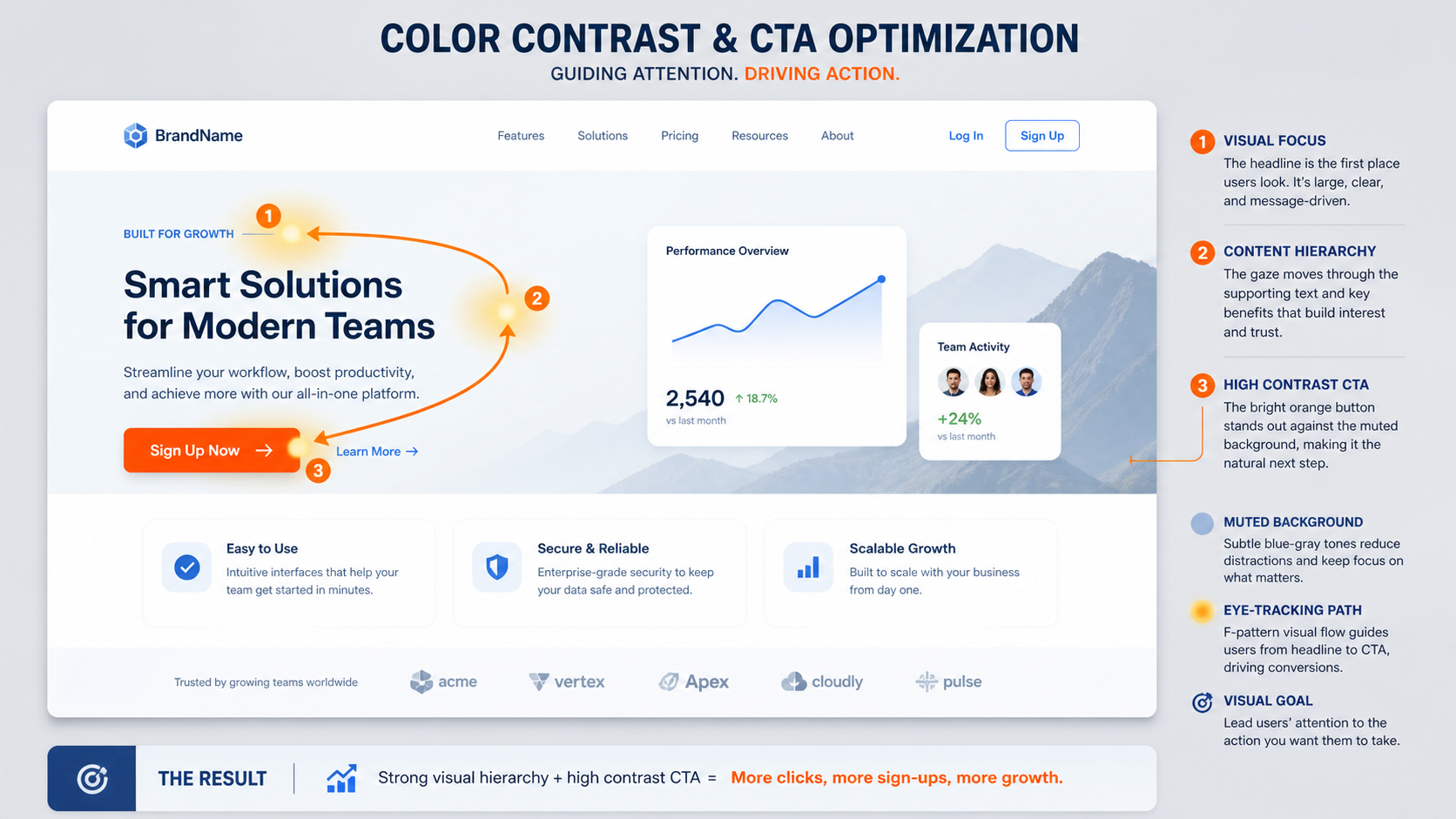
If you only fix one thing, fix this. Contrast is how much something stands out from what's around it. It does two jobs:
- Readability — If text doesn't have enough contrast against its background, people physically struggle to read it
- Attention steering — Your CTA should be the highest contrast thing on the page
Research from the University of Winnipeg shows that people need about 50 milliseconds to form an opinion about a website. Color contrast is the fastest signal for directing attention.
"A button that people don't see might as well not exist. Most of your site should sit in a calm, restrained palette — then your one key action pops out against it."
Social Proof — Trust at the Point of Doubt
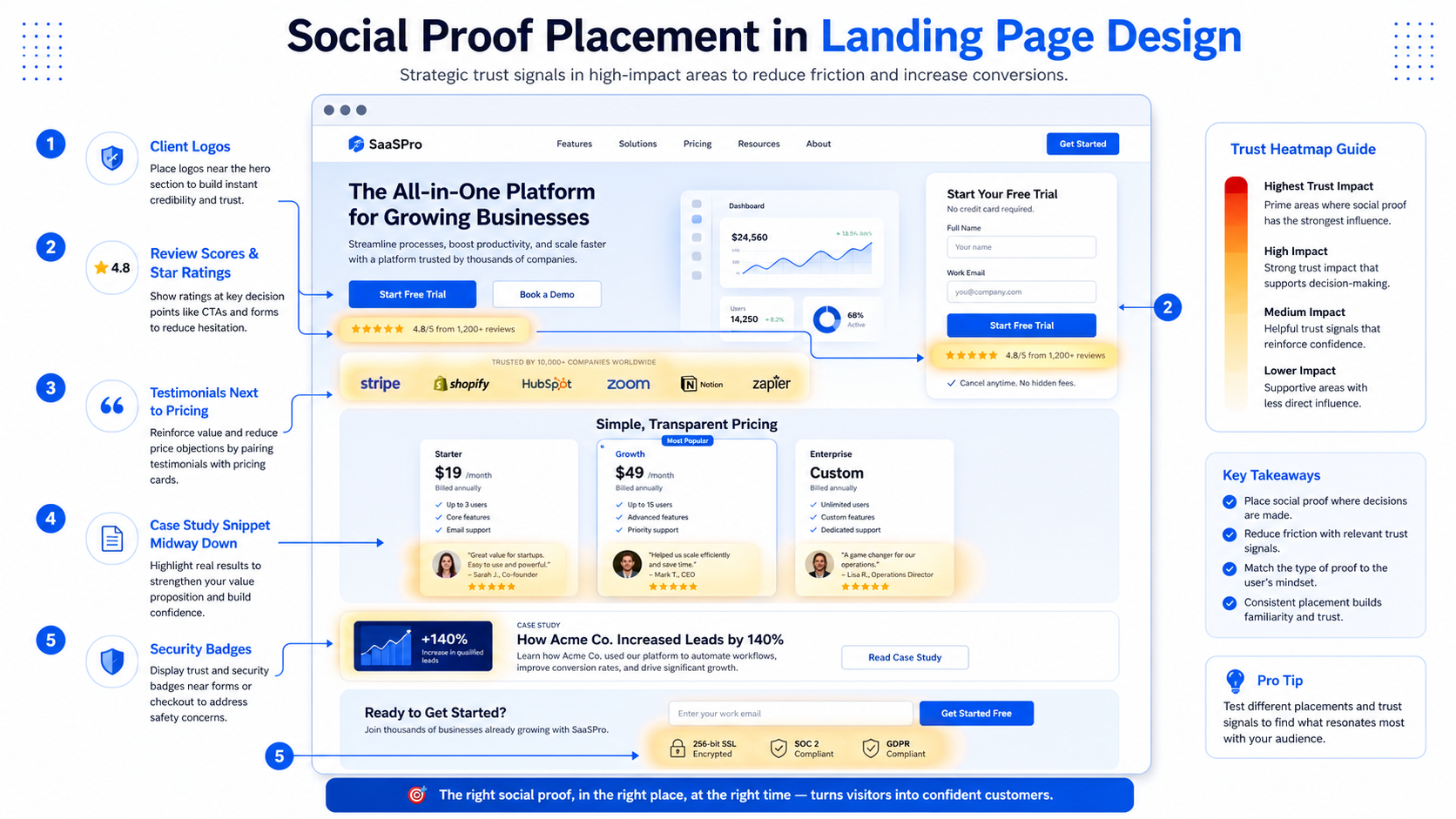
You already know to use social proof. The upgrade is where you put it. Most sites bury testimonials on a separate page nobody clicks, or drop a wall of five-star quotes far from any decision point.
Proof must sit at the point of doubt:
- Client logos — Near the hero section (trust in first 2 seconds)
- Testimonials — Right next to the price (where worry lives)
- Review scores — On the thing being decided about, in the moment of deciding
According to BrightLocal, 87% of consumers read online reviews for local businesses, and trust peaks when reviews are placed near conversion points.
"You're putting reassurance exactly where hesitation is — so it answers the doubt before they've even finished having it."
Typography — The Professional Signal
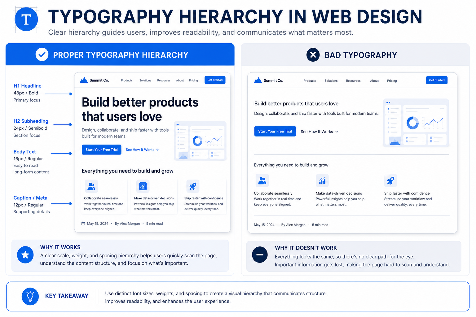
Typography is one of the clearest signals of whether a site was built by a professional. The science comes down to two moves:
- Use fewer fonts — One or two across the entire site. Four or five fonts fighting each other = amateur. Restraint reads as control.
- Clear size order — Big confident headings, clear subheadings, body text at a readable size with proper spacing.
Research from MIT shows that font choice affects perceived credibility by 20%. Clean, readable fonts increase time-on-page by up to 30%.
"Save the personality for the headline, keep the body copy clean. A site nobody can comfortably read is a site nobody stays on."
Mobile — The Majority Experience
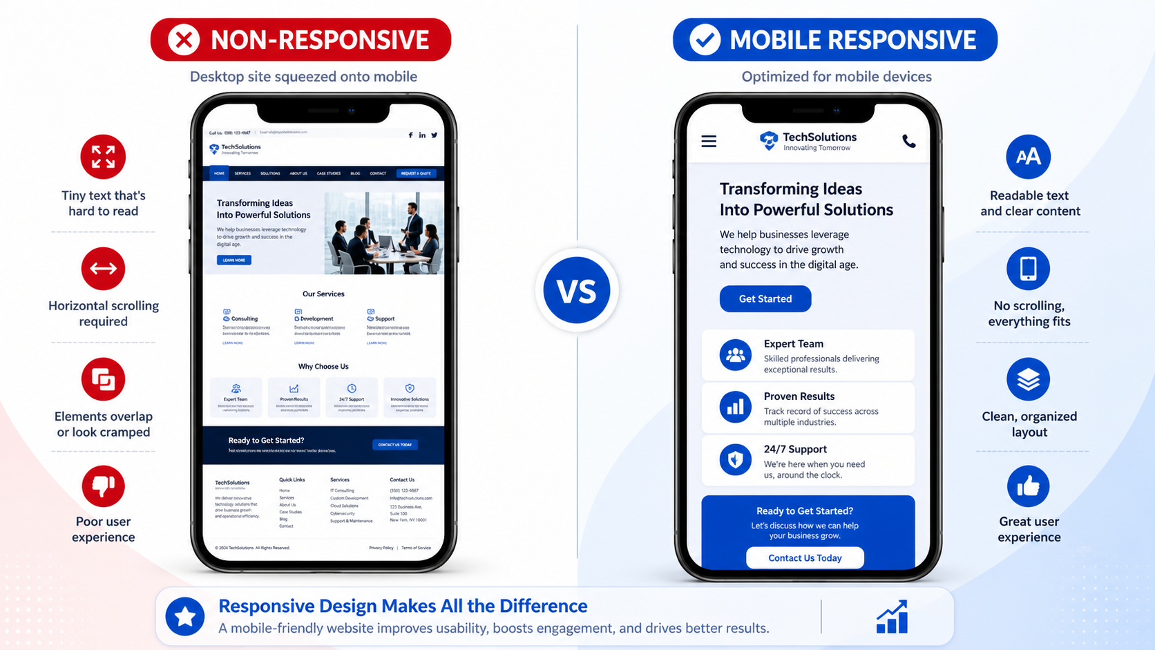
Most designers treat mobile as an afterthought, but 60%+ of web traffic is mobile. A site that looks beautiful on desktop but falls apart on a phone is failing for the majority of visitors.
Common mobile failures:
- Text too small to read
- Buttons too close to tap
- Content running off the screen
- Horizontal scrolling required
Google's Mobile-Friendly Test confirms: mobile-optimized pages have 5x higher engagement rates. The fix is a habit: check every build on a real phone held in one hand before calling it done.
"If you build for mobile and check on a phone from the start instead of bolting it on at the end, you've already beaten most sites out there."
The Science Behind Each Principle
These seven principles aren't separate tricks — they're one skill wearing seven different hats. Every principle is doing the same job: controlling where the visitor looks and what they feel while looking.
The research backs this up. Eye-tracking studies from the Nielsen Norman Group show that users follow predictable patterns: F-pattern for text-heavy pages, Z-pattern for visual pages. The principles above work with these natural patterns, not against them.
A study published in the journal Behaviour & Information Technology found that users form aesthetic judgments in as little as 50 milliseconds. This means your design communicates trust (or lack of it) before any content is read.
Key Takeaway
The difference between a site that looks fine and a site that looks premium isn't taste — it's deliberate decisions. Every principle above is a choice you make on purpose, not by accident.
How to Apply These Principles
Walk through your current site with these questions:
- Hero: Where does the eye land first? Can a visitor make a decision from the hero alone?
- Hierarchy: Squint at the page. Can you still tell what's most important?
- Space: Is there room to breathe, or is everything crammed?
- Contrast: Does the CTA stand out above everything else?
- Proof: Is trust sitting where the doubt is?
- Typography: How many fonts? Is body text comfortable to read?
- Mobile: Can you read everything and tap every button with one hand?
Every principle you tighten makes the whole thing look more expensive. You don't need more talent — you need to stop leaving things to chance.
📚 Sources & References
- Video 7 Web Design Principles — Expert Analysis (YouTube) 17+ years experience, Fortune 500 clients including 3 major companies
- Research F-Shaped Pattern of Reading on the Web — Nielsen Norman Group Eye-tracking study on how users read web content
- Research Aesthetic judgments of websites — Behaviour & Information Technology 50ms aesthetic judgment formation
- Research White Space in UX Design — University of Wichita Study 20% comprehension improvement with proper white space
- Article How Users Assess Web Credibility — Stanford Web Credibility Project 75% judge credibility based on design alone
- Research Local Consumer Review Survey — BrightLocal 87% read online reviews
- Research Mobile Page Speed Benchmarks — Google 5x higher engagement for mobile-optimized pages
- Research Font Choice and Credibility — MIT 20% credibility impact from font choice
- Article First Impressions of Websites — How Design 94% of first impressions are design-related
- Research Time to Think: Evaluating Visual Complexity — Microsoft Research 50ms visual complexity judgment
- Article Above the Fold: Still Matters — Crazy Egg 55% of visitors spend fewer than 15 seconds
- Article Contrast in Web Design — HubSpot CTA contrast optimization data